No Apologies for Subject Matter
Happy Friday folks! Hope everyone has had an easy week. Hope you're ready for an art history class.
Retro Perspective
On June 11th, we lost one of the greats. In honor of one of my fav painters passing, The Overthink presents its own retrospective.
Welcome to David Hockney: A Life that Captured a 17-year-old Carly' Attention in her High School Art Room
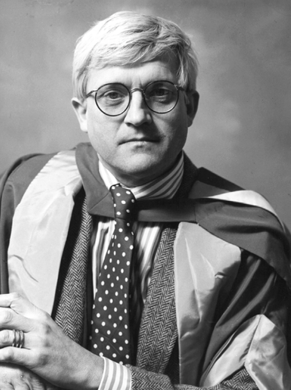
For those who have never heard of David Hockney, he was a prolific painter, photographer, and set designer born in England in 1937. In his lifetime, he created well over 8,000 works of all mediums, spanning an over 60 year career.
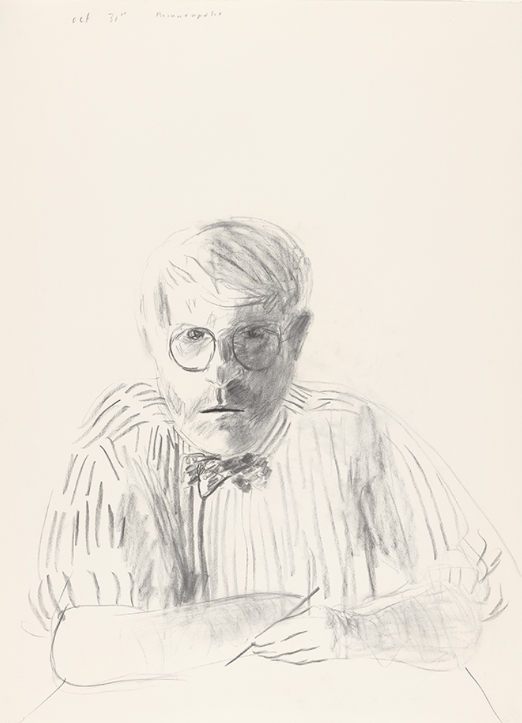
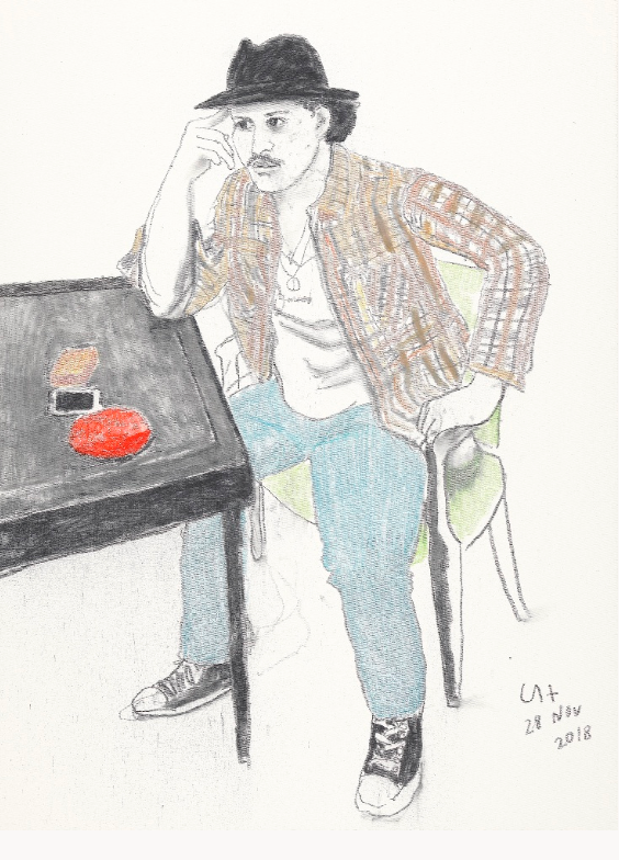
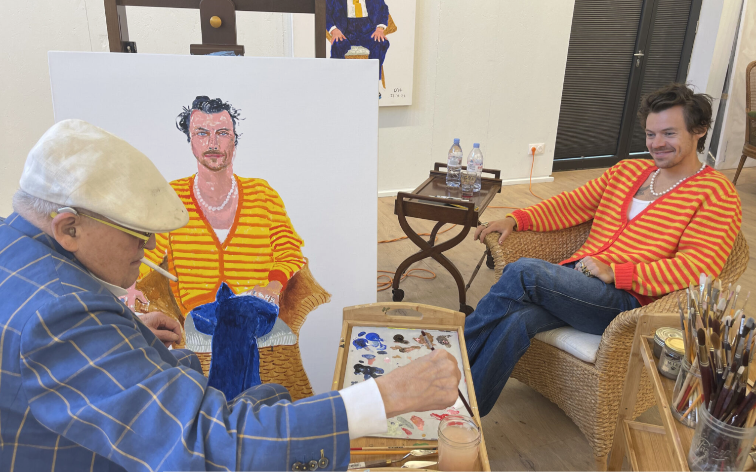
I was introduced to his portraits in high school so I feel that that's what he is most widely known for. However, his body of work spans just about every medium you could possibly imagine from oil paints to sculpture to digital painting on an iPad. Across his career, there was focus on paint and photography and kind of mish-mashing techniques for these two disciplines in particular.
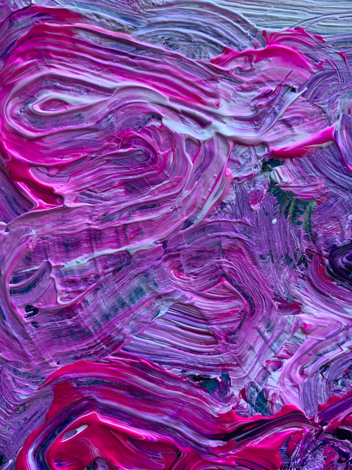
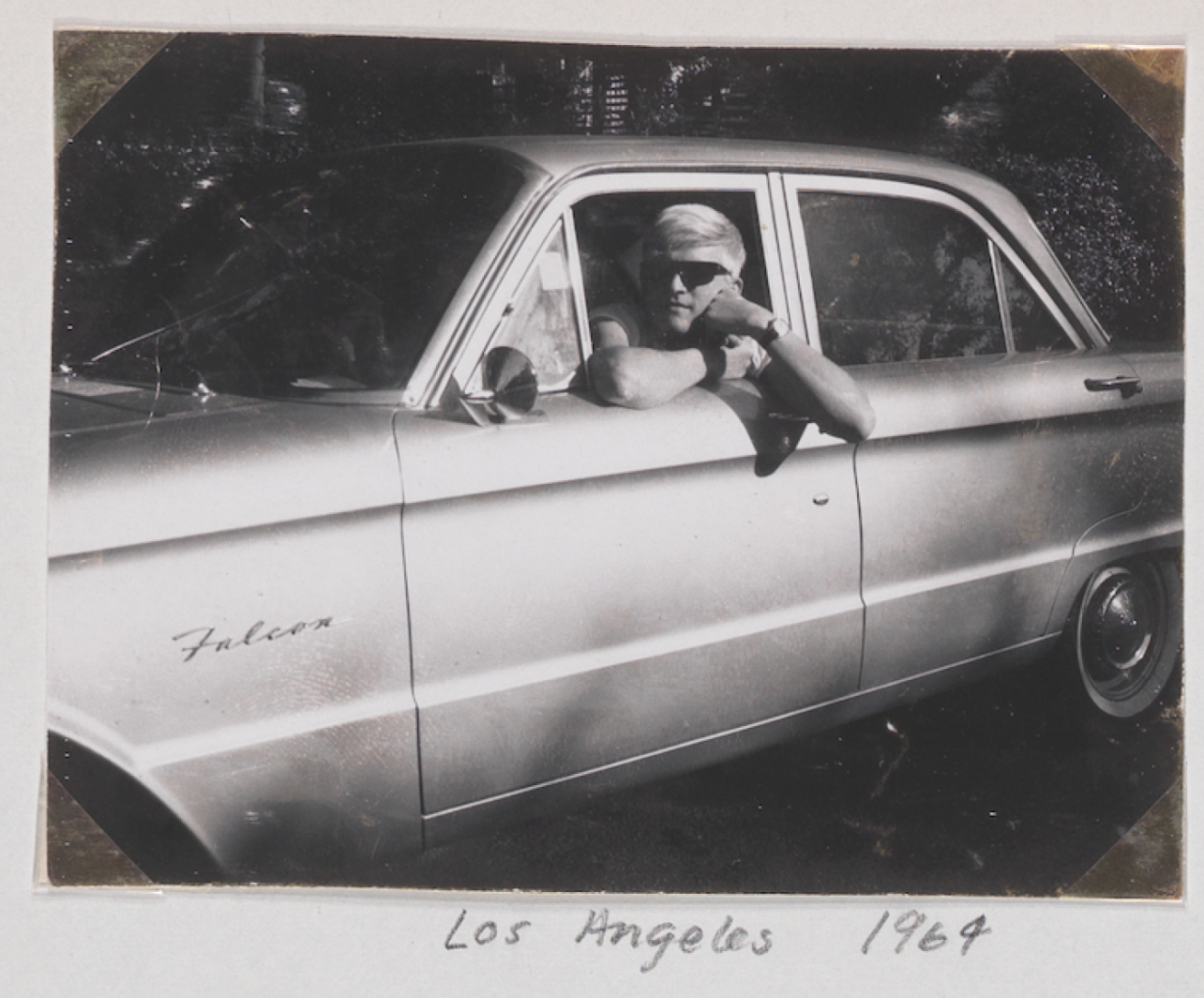
He entered the art scene in the 1960s, moving to Los Angeles in 1964 where he began making a series of paintings depicting swimming pools. He did this using acrylic paint, a new medium at the time which allowed for vivid color use. These paintings drew on the pop art movement's aesthetic and themes of celebrating the mundane. In an article discussing Hockney's artistic influences, Erin Argun wrote,
"Known for his admiration for the Old Masters, Hockney is deliberate in his flouting of artistic conventions and rules, playing with proportion, linear perspective, and colour theory..."
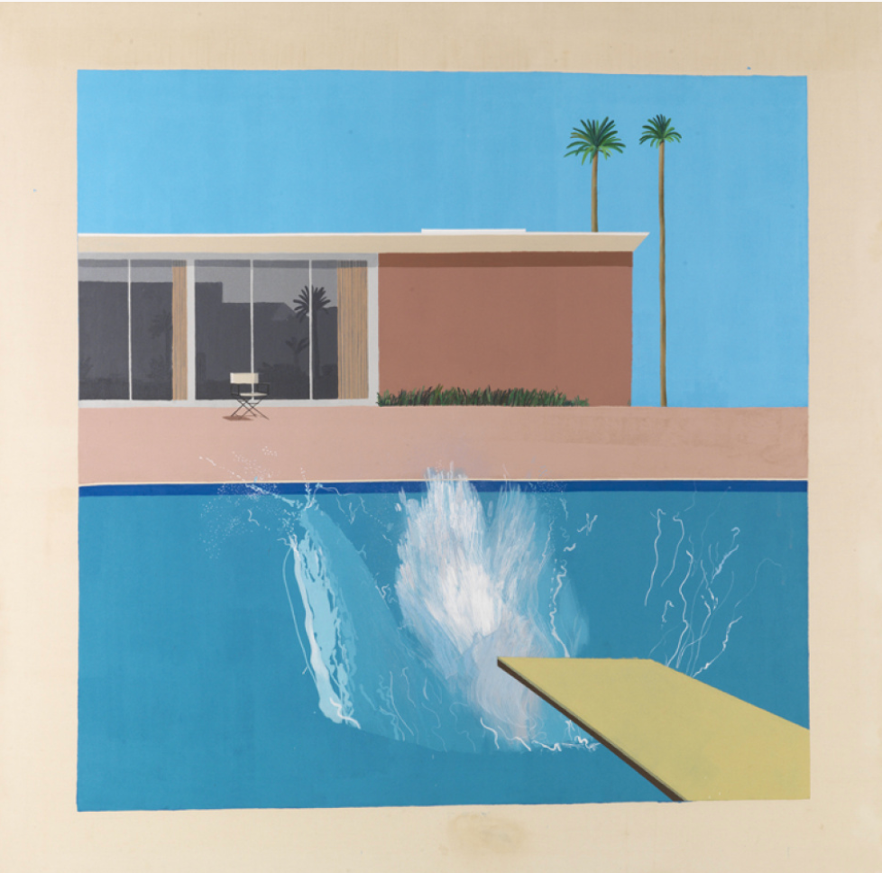
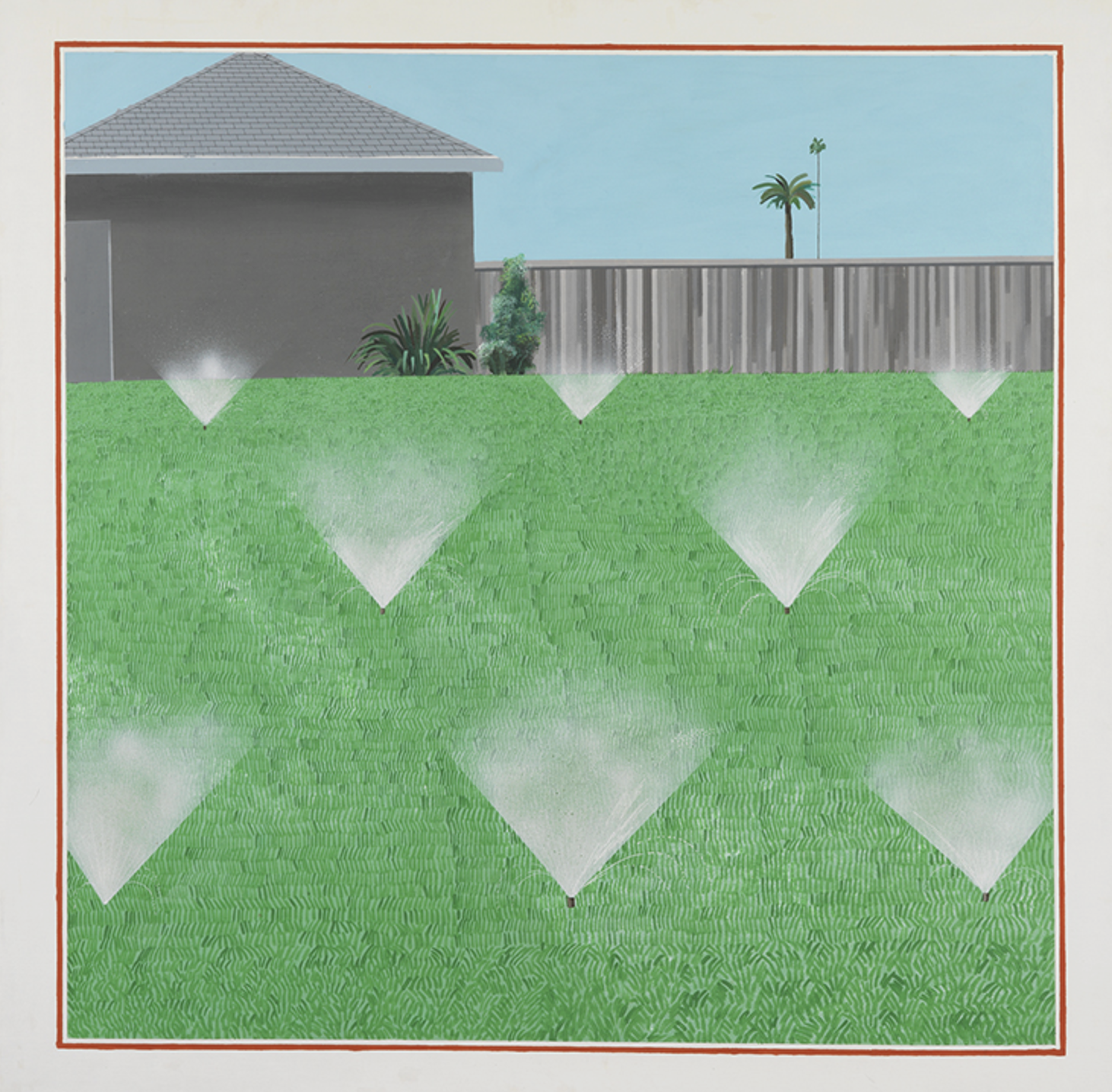
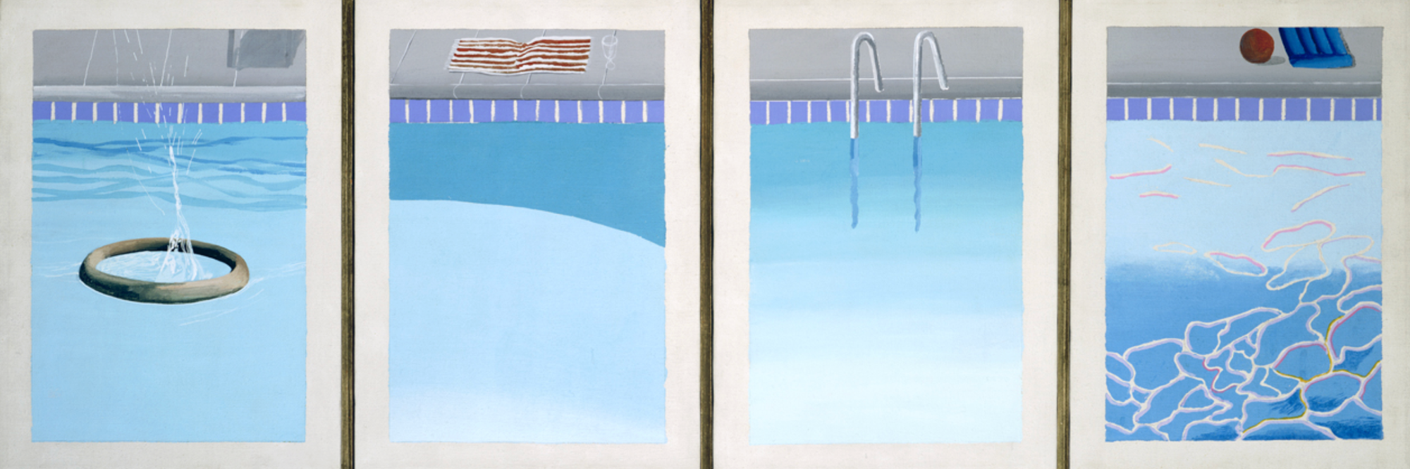
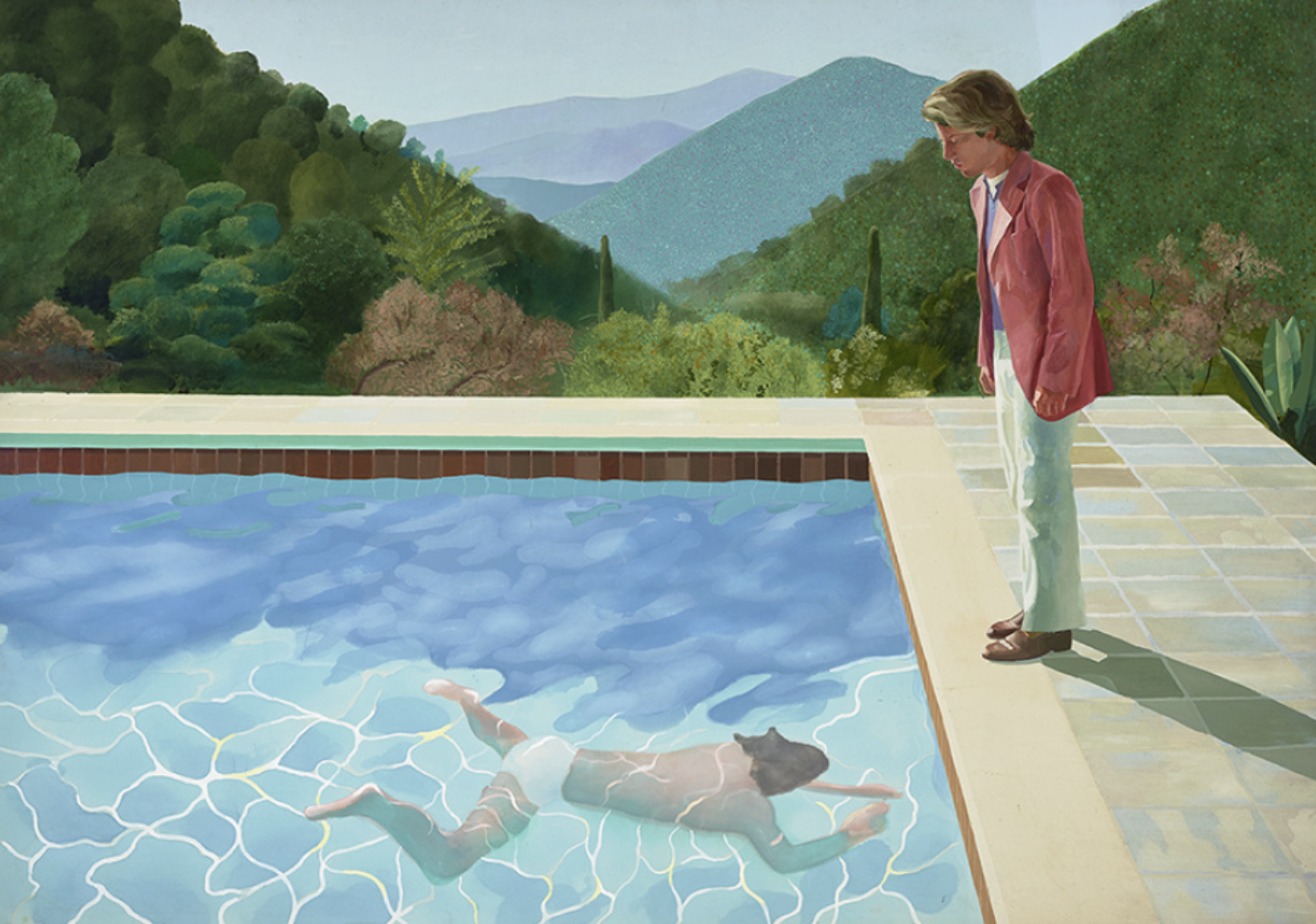
"A Bigger Splash" 1967, "Lawn Being Sprinkled" 1967, "Four Different Kinds of Water" 1967, and "Portrait of an Artist (Pool with Two Figures)" 1972
In the 80s, Hockney started experimenting with polaroid photography and photo-collages. He would choose a subject and take several photos to create a patchworked composite image that he felt better represented the human eye's perspective than a traditional, flat photo. In 1982, he created over 140 polaroid collages in a matter of months.
In the book "True to Life: Twenty-Five Years of Conversations with David Hockney" by Lawrence Weschler, Hockney explains his feelings on the limitations of the medium:
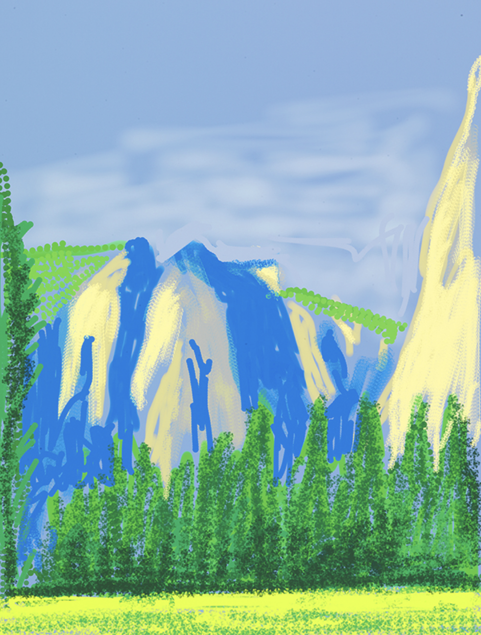
"Photography seems to be rather good at portraiture, or can be. But, it can't tell you about space, which is the essence of landscape. For me anyway. Even Ansel Adams can't quite prepare you for what Yosemite looks like when you go through that tunnel and you come out the other side."
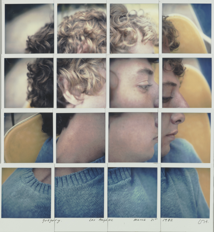
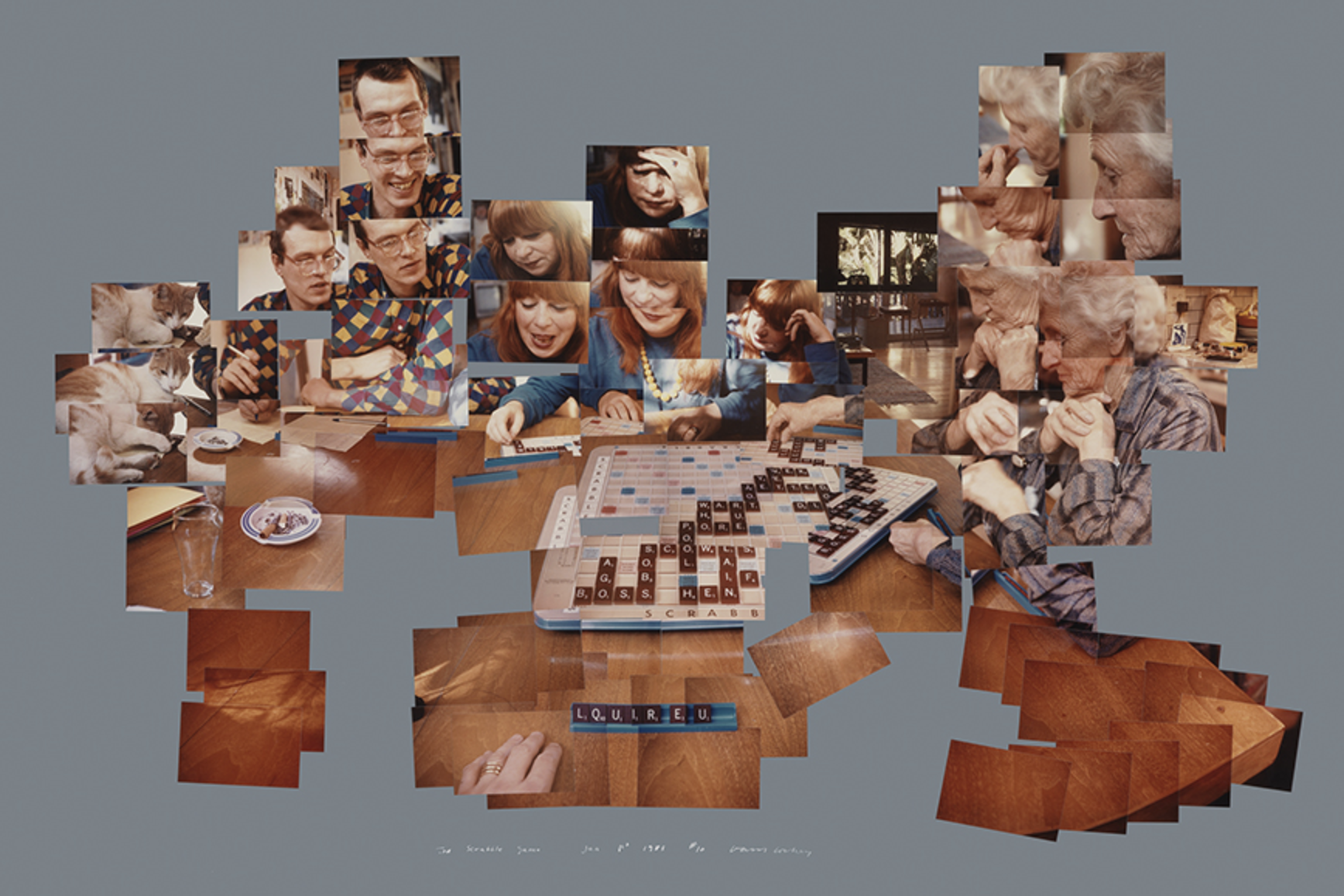
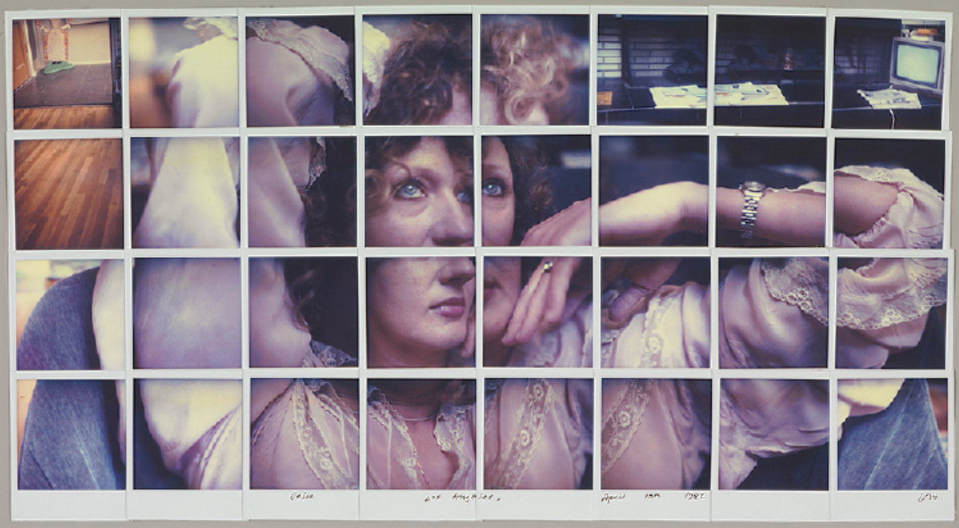
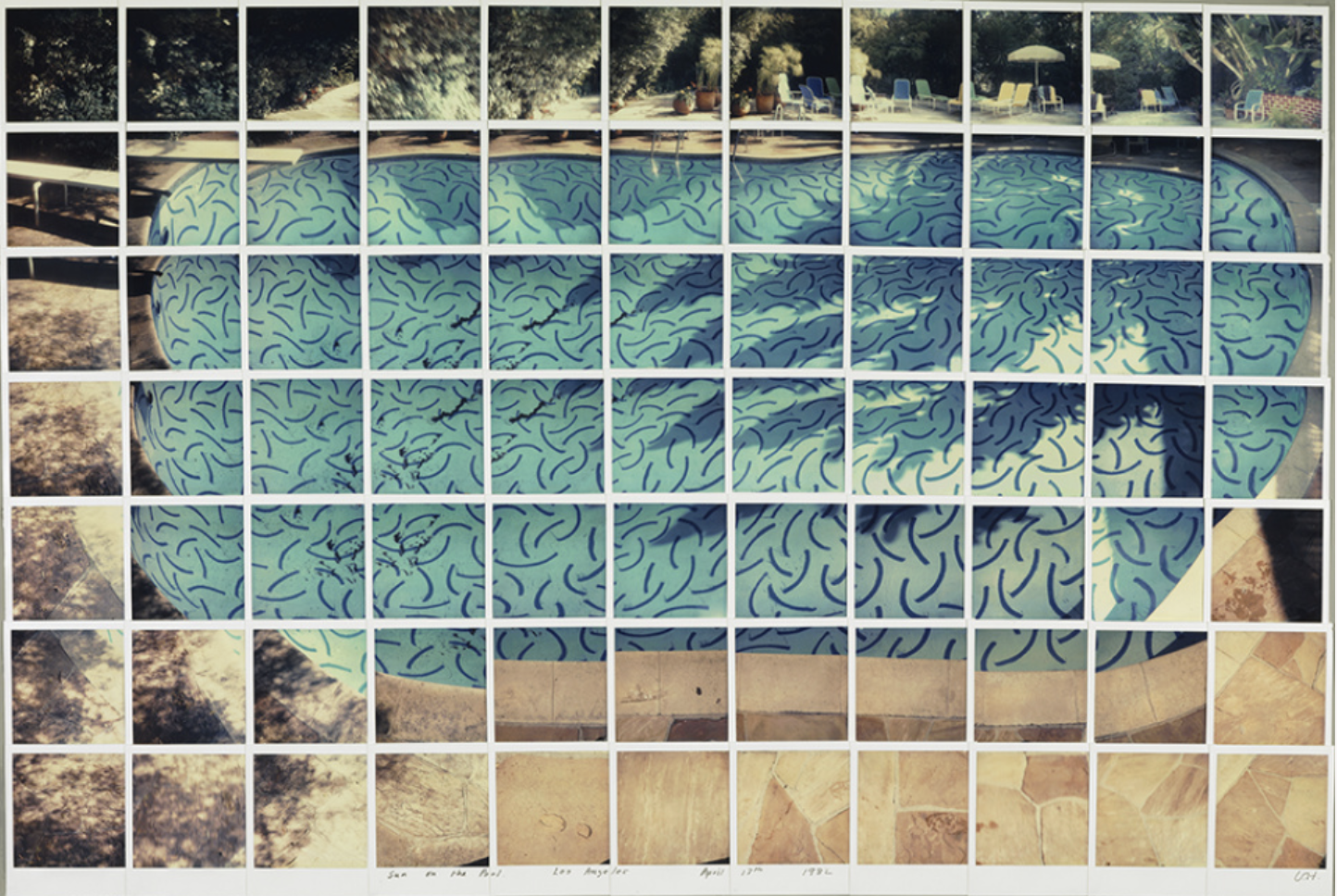
"Gregory. Los Angeles. March 31st" 1982, "Celia. Los Angeles. April 10th" 1982, "The Scrabble Game, Jan. 1st" 1983, and "Sun on the Pool Los Angeles April 13th" 1982
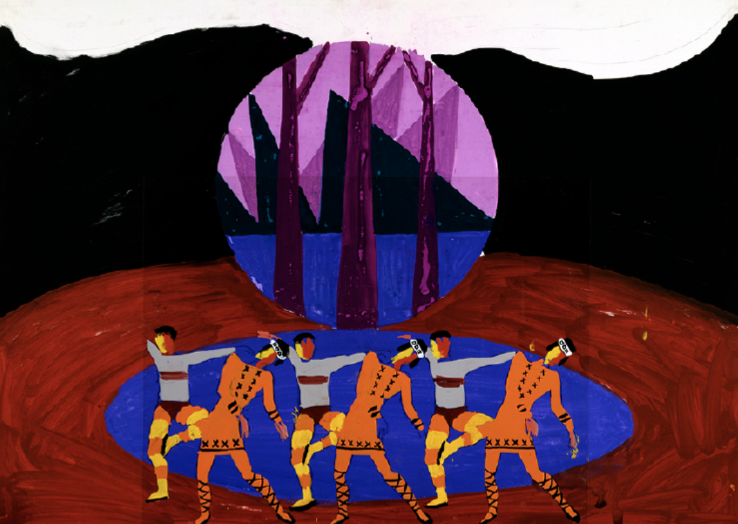
Through a lot of his career, Hockney designed sets for opera companies like LA Opera, The Metropolitan Opera, and the Glyndebourne. I actually had no idea that he did any of this until bestie Alex sent an article. The combo of intense forced perspective and really bold, primary color choices are super interesting.
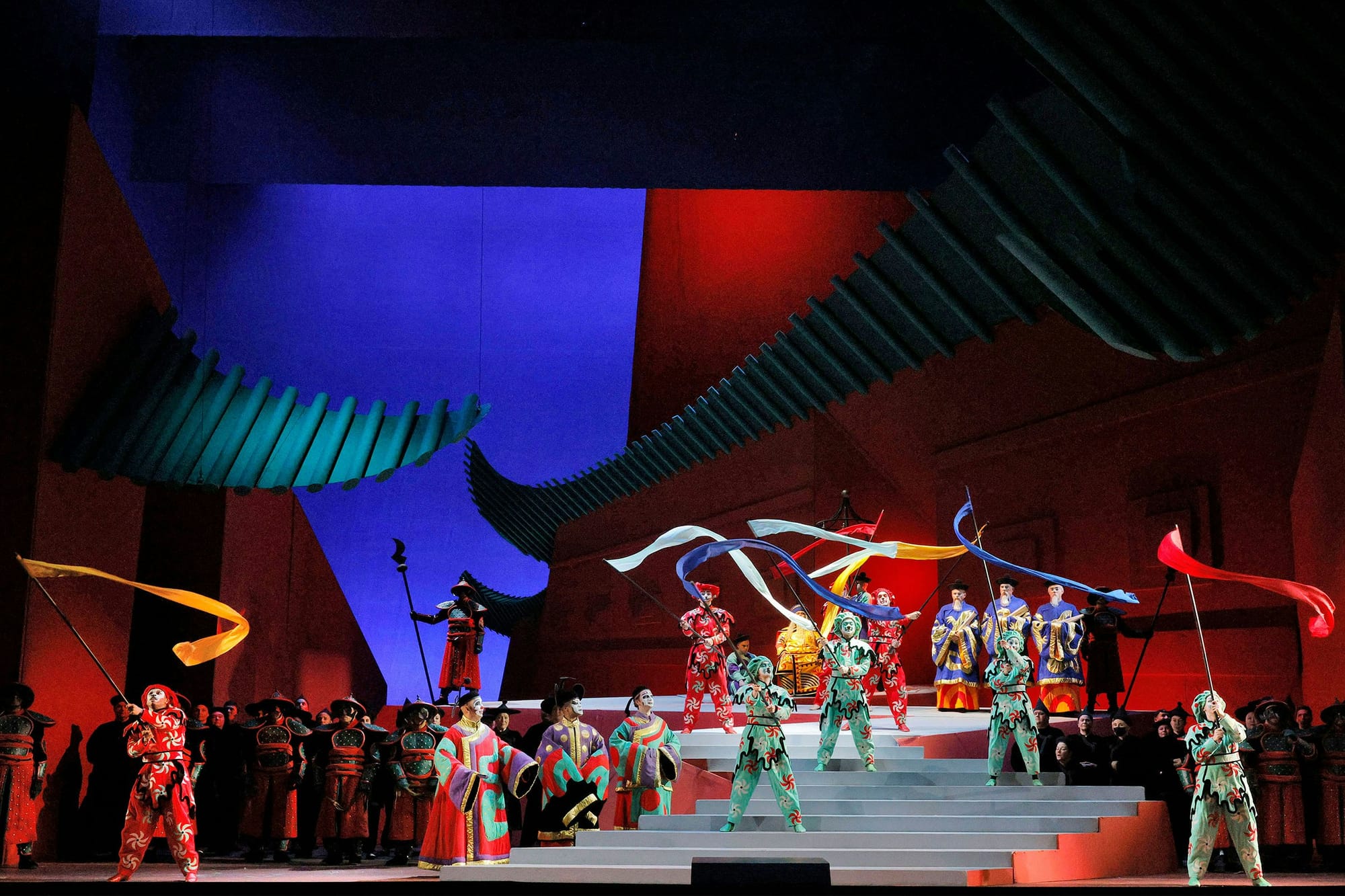
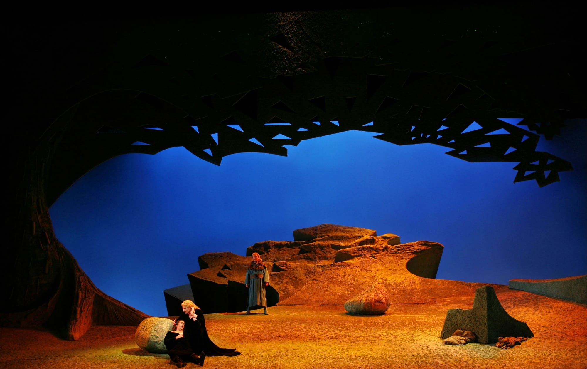
Turandot (1991) and Tristan und Isolde (1987)
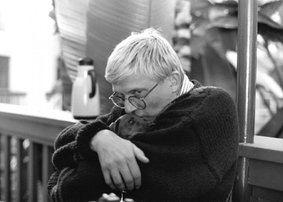
One of my fav eras of painting from him was in the early 90s when he was really into capturing his two dachshunds, Stanley and Boodgie. Between 1993 and 1995 he created hundreds of paintings of the two dogs, culminating in the Dog Days series and eventual book. It's evident that being an out, gay man in the 80s and early 90s was not an easy lifestyle to say the absolute least, and that his dogs provided much needed emotional support during a time where he was grieving several friends and peers.
He's quoted in the forward of Dog Days saying:
“I make no apologies for the apparent subject matter. These two dear little creatures are my friends. They are intelligent, loving, comical and often bored. They watch me work; I notice the warm shapes they make together, their sadness and their delights. And, being Hollywood dogs, they somehow seem to know that a picture is being made.”
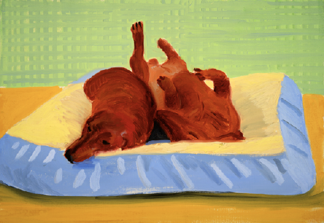
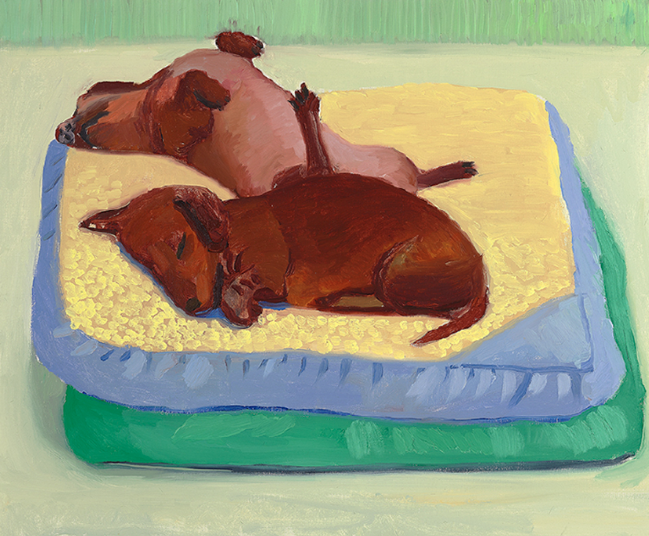
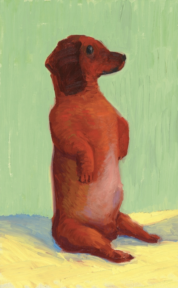
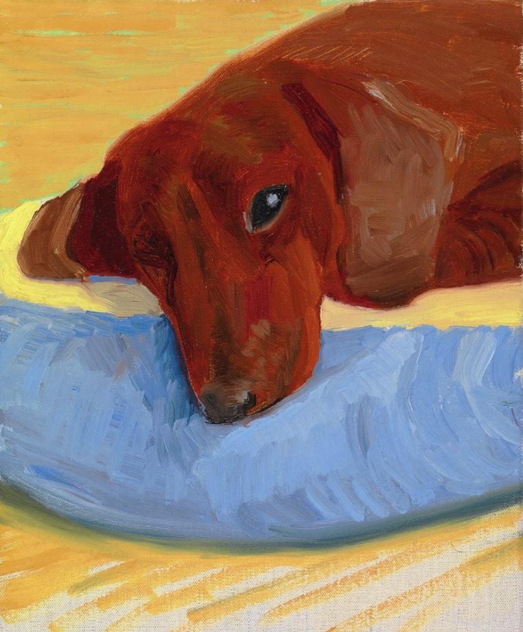
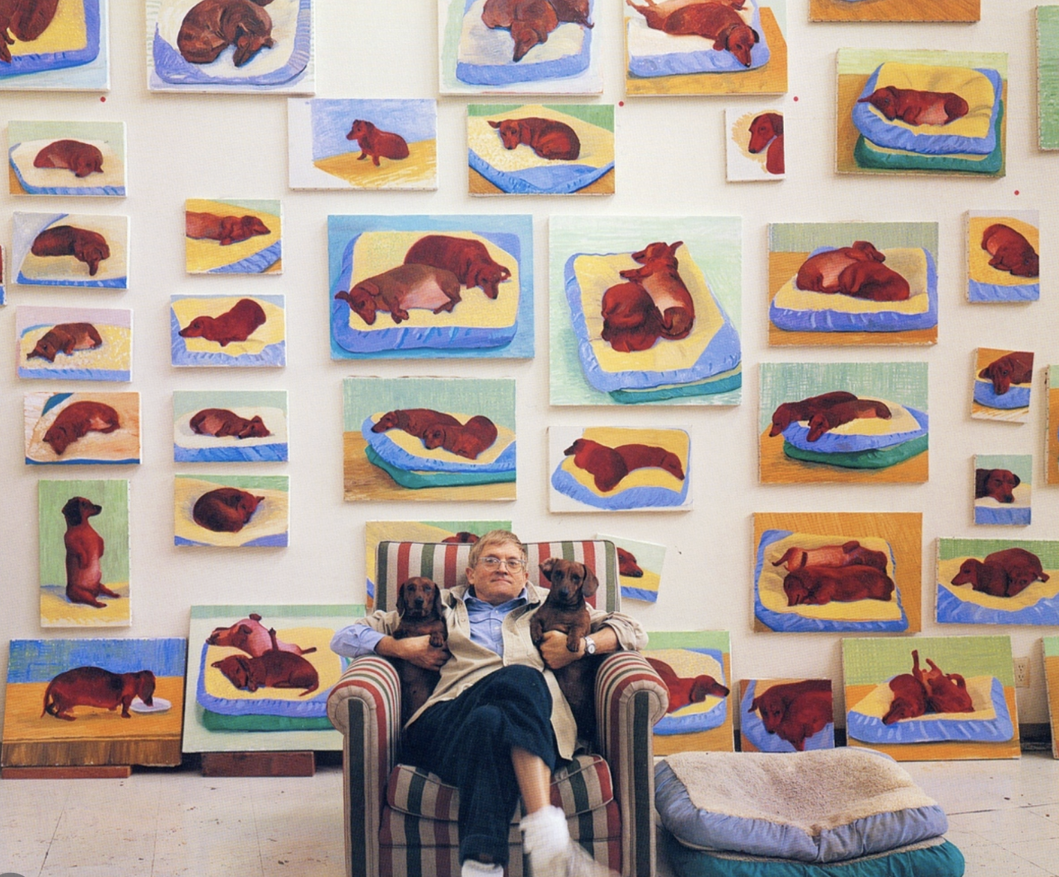
"Dog Painting 25" 1995, "Dog Painting 12" 1995, "Dog Painting 41" 1995, "Dog Painting 35" 1995
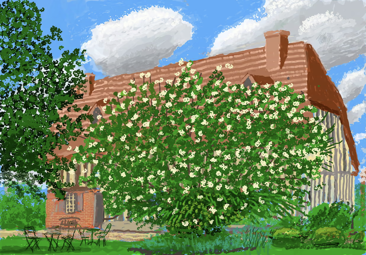
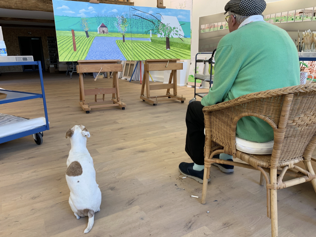
In the 2010s he became obsessed with digital art. He utilized drawing tablets, iPads, and iPhones to create landscapes and portraits. In 2020 during the initial lockdown, he moved to Normandy, France and began each day walking outside and drawing the changes in the gardens on the property.
Stephanie Barron, lead curator of modern art at LACMA said in an article about his iPad drawings,
"...he would share these images with his friends; each morning I would awake in L.A. and be greeted by an emailed iPad drawing from David, reminding me of all the beauty in the world. 'Don’t worry,' he’d say with his characteristic sly wit, 'they can’t cancel the spring.' He helped many of his friends get through those dark and lonely days. He saw the world like no one else."
I find it fascinating that he would be into drawing digitally as a traditional painter. I don't know if any of the folks reading this have ever tried to use a tablet to draw, but you have so little control over the lines and there's no tactile feedback to what you're doing like there is with traditional painting. It's honestly really difficult. Plus these drawings were done using a free app called Brushes, not even Procreate or Illustrator. If you zoom in on any of these you can see all kinds of glitches and mistakes. I think this series above any other, shows Hockney's love of process and his enjoyment in the act of making art as opposed to a final product.
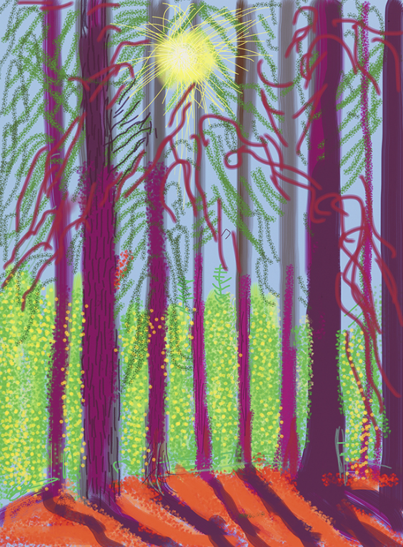
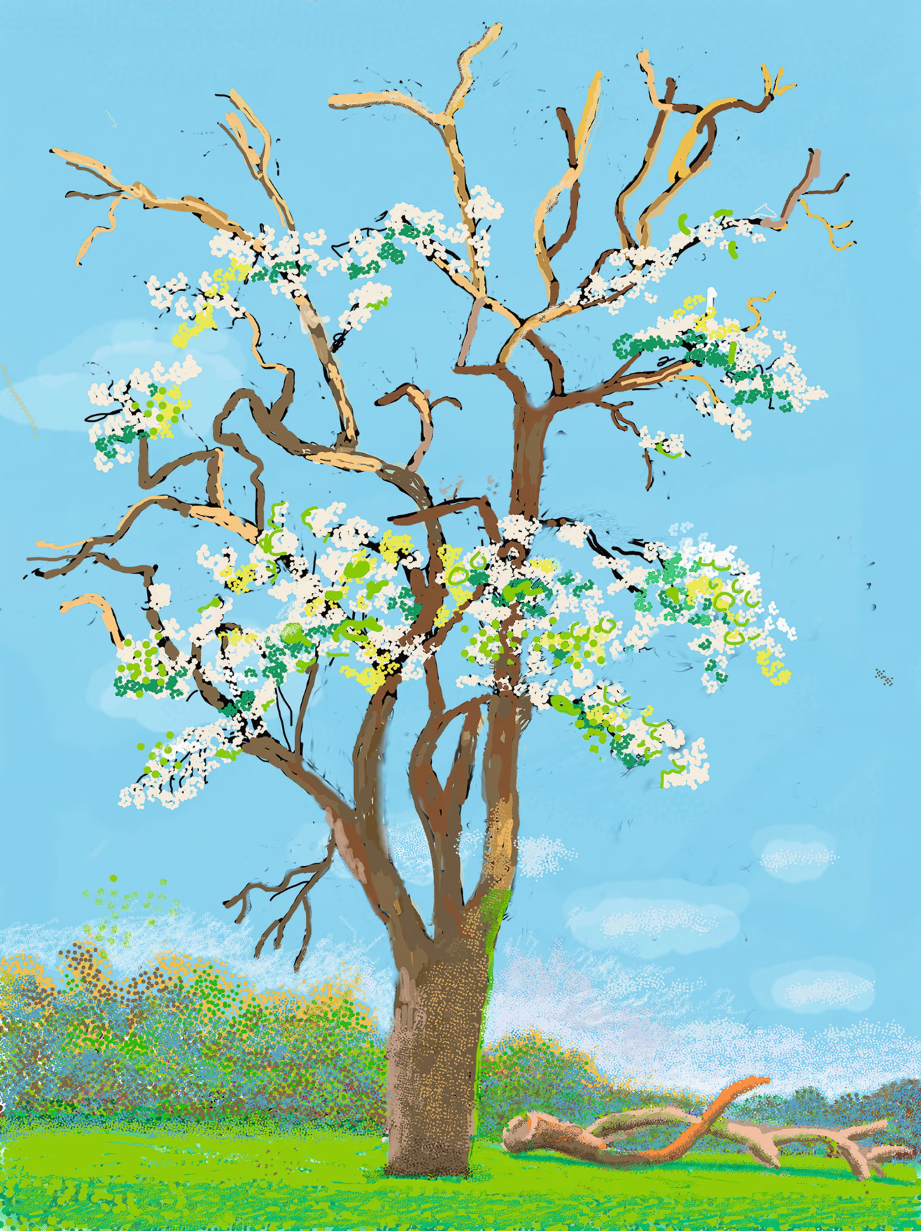
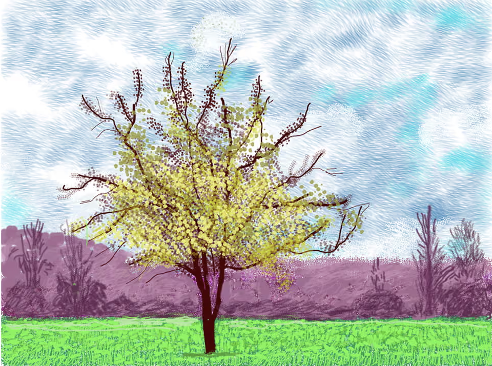
"Yosemite Suite 4" 2010, "No 147, 8 April 2020", "No 88, 3 March 2020", and "No 316, 30 April 2020"
If you've stuck with reading this, I appreciate you. David Hockney is one of my all-time favs and I was legitimately sad when I heard about his passing. I have always loved his exciting use of color but I've come to really appreciate the sheer volume of work he produced in his lifetime and how he was not afraid to try new things and experiment and make things that were not specifically meant to be archival quality. I hope to emulate more of that mindset going forward.
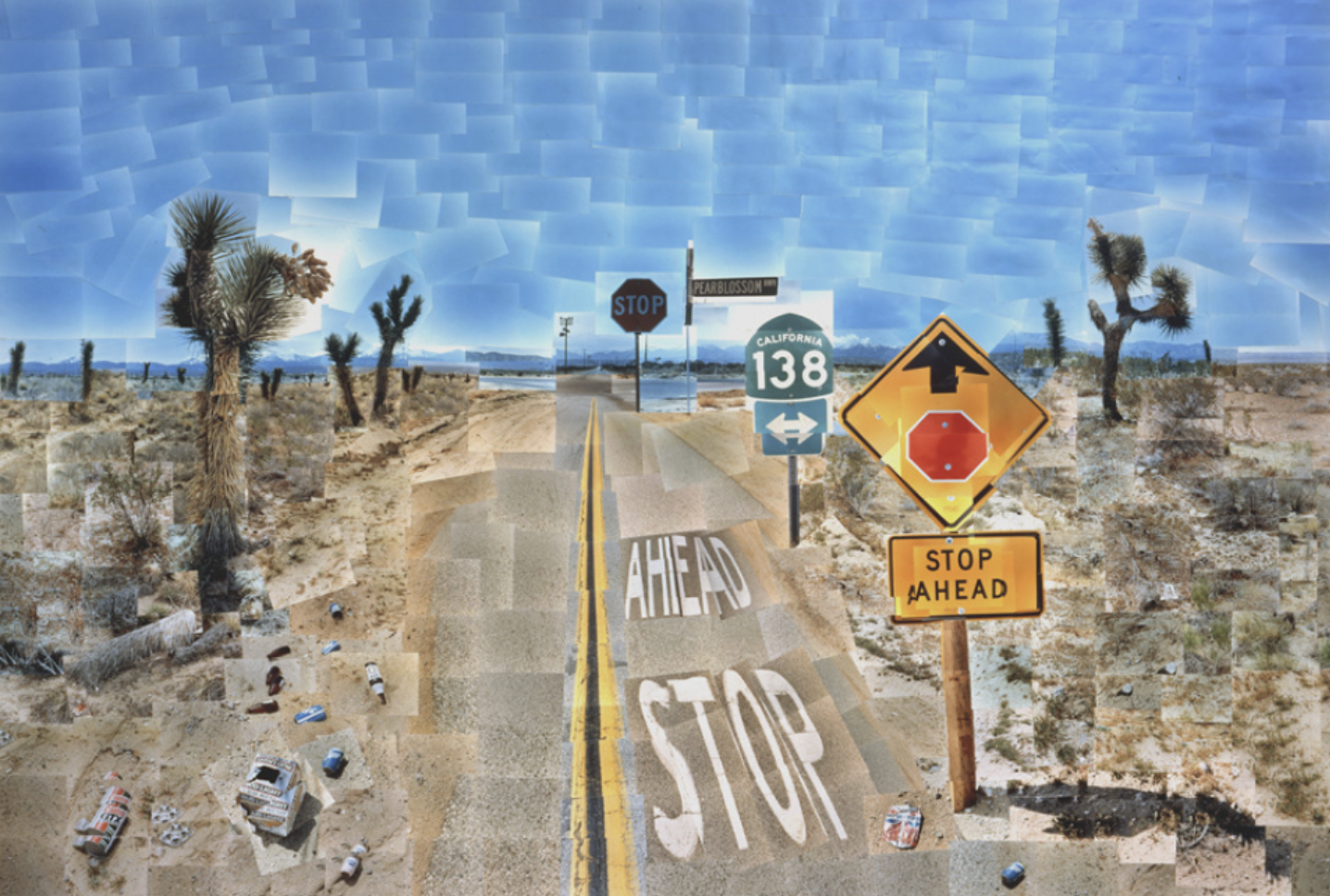
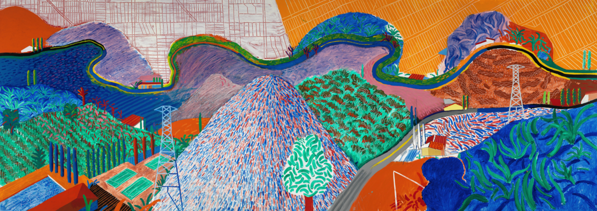
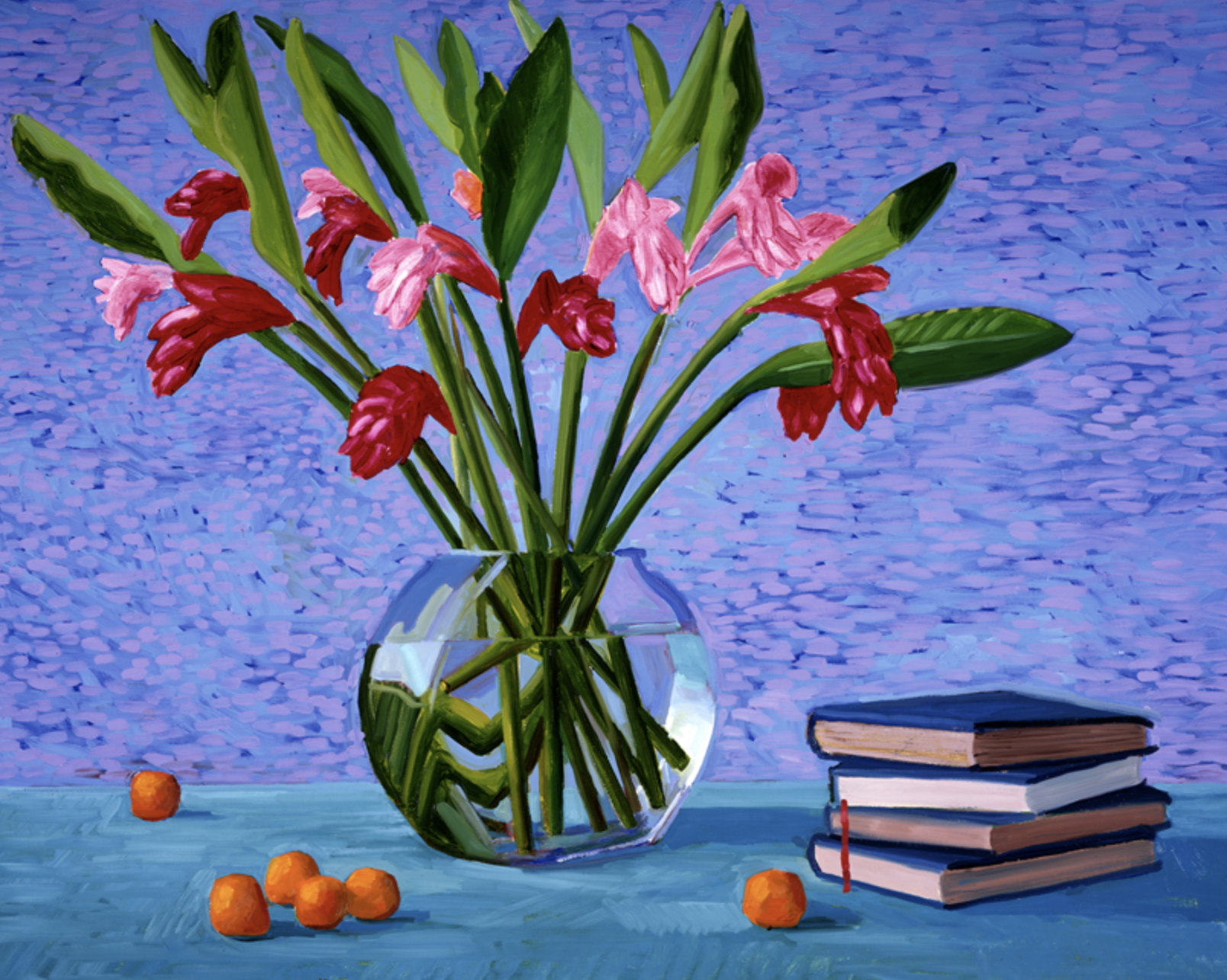
"Pearblossom Hwy., 11 - 18th April 1986", "Mullholland Drive: The Road to the Studio" 1980, "Red and Pink Ginger with Books and Oranges" 1996, "Untitled, No. 2" 2010, "Bruno Mars" 2018, "Superimposed Figures VII from 'La Sacre du Printemps'" 1981,
If you're interested in reading more, I mostly used the David Hockney Foundation Website, this Guardian article, this LACMA piece, and this Tate article to write all this.
What's For Dinner
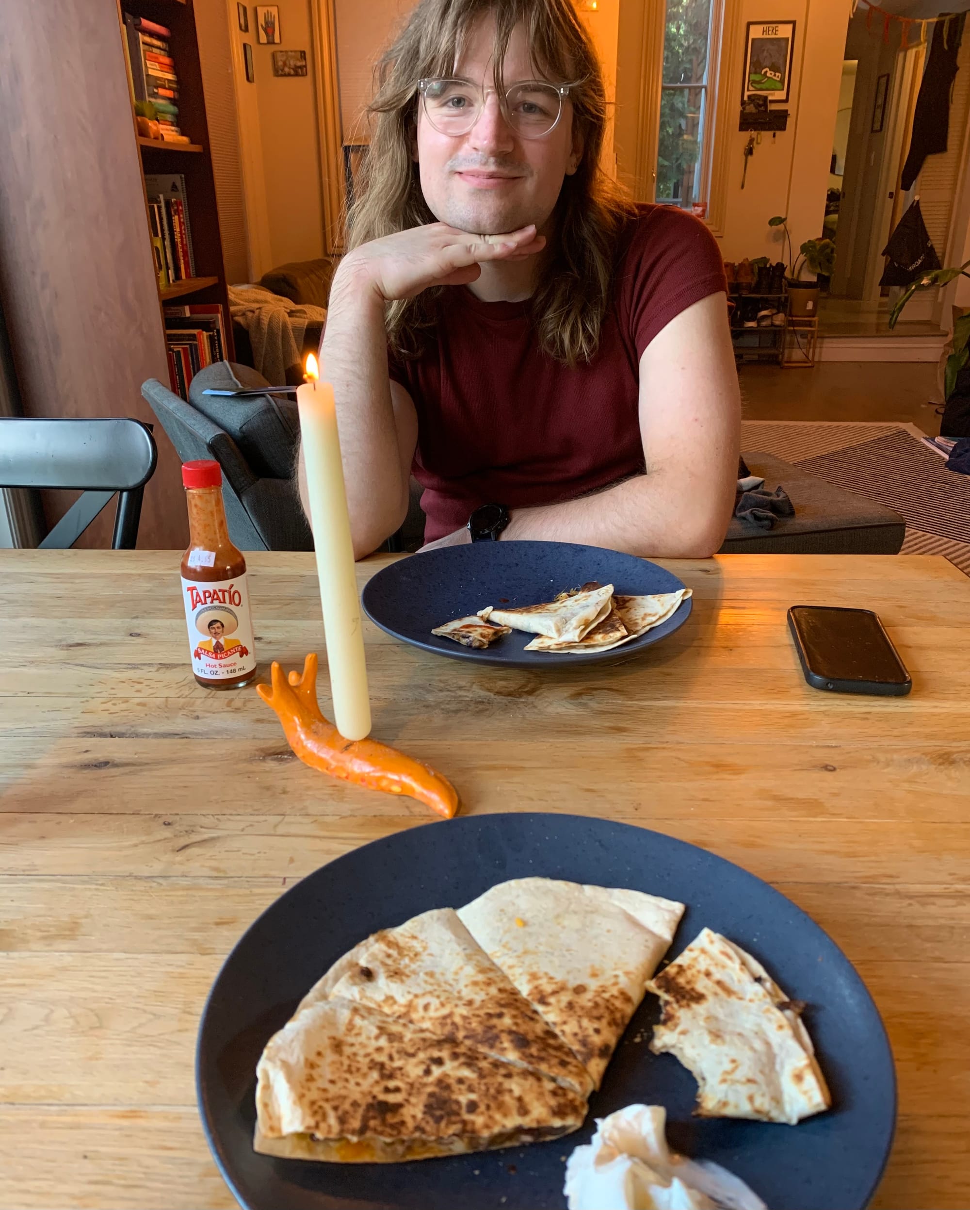
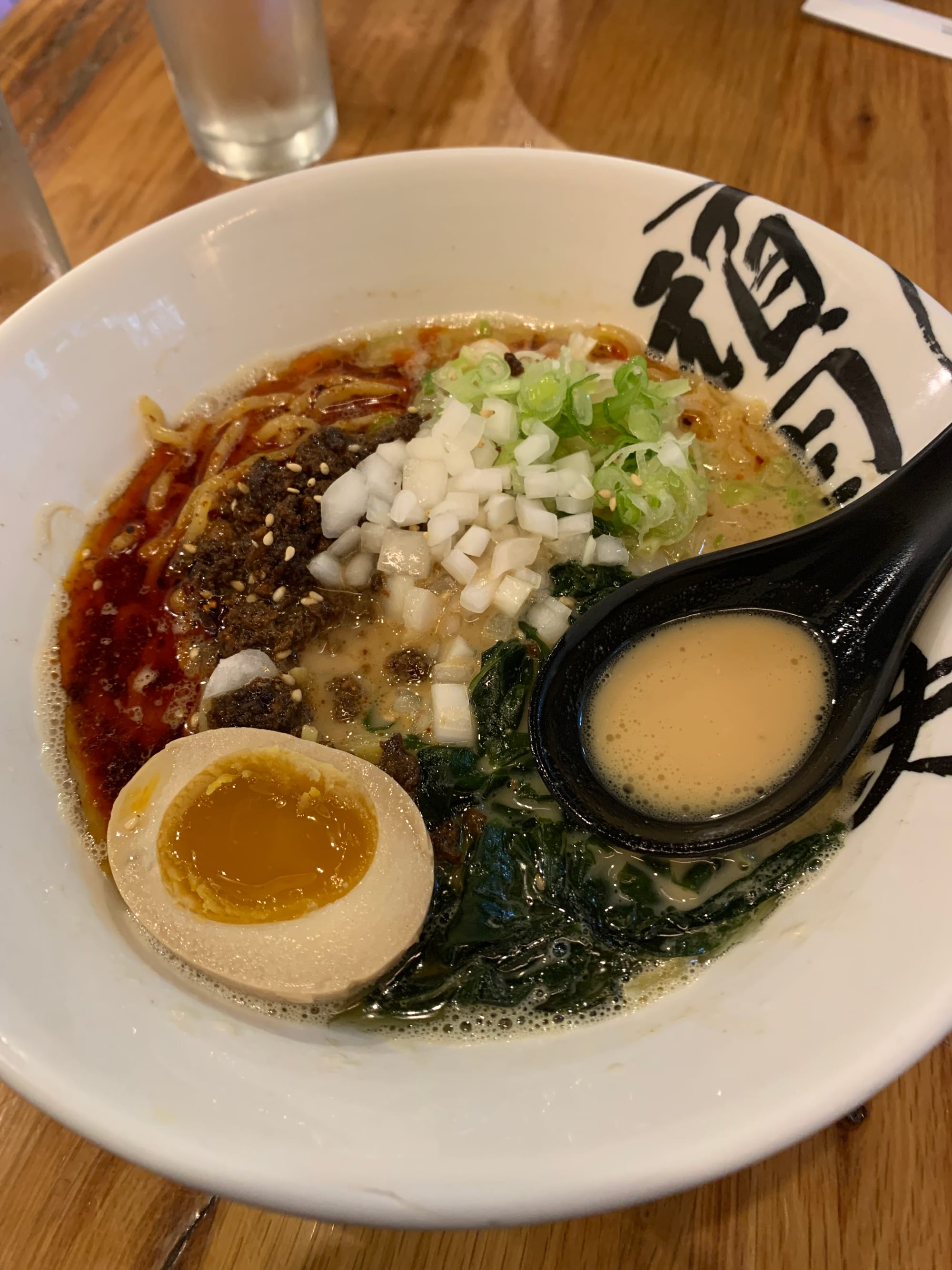
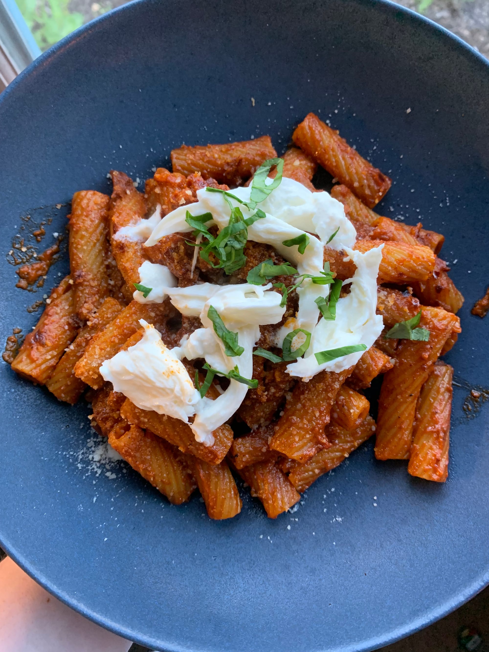
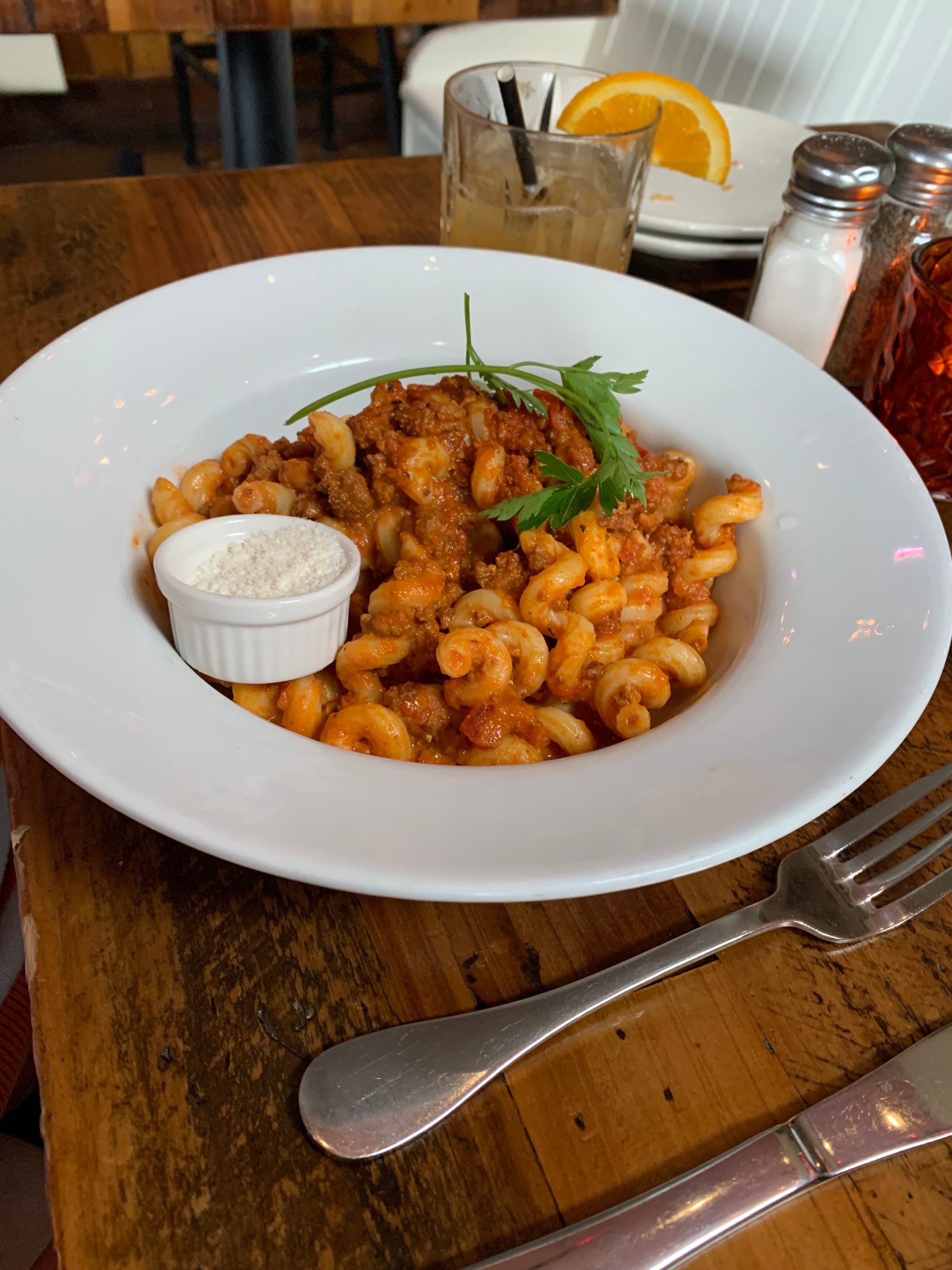
If that was too much for you, here are some photos of some fab dinners I've had in the past two weeks. We've got candlelit quesadilla dinner (yum!), ramen from Ganko Ittetsu in Brookline (my fav!), some clean out the fridge pasta (i love burratta!), and Amy's bolognese that was better than my dinner at Bitter Ends in Wells, ME (the bolognese was also not very good!).
C Ya
rec-o-roos
a song i'm loving:
- Mary Jane - MUNA
a movie i watched:
- Disclosure Day (2026) - 3/5 stars. I think it would've been stronger if there were fewer CGI aliens.
a book i'm reading:
- Tramps Like Us by Joe Westmoreland